Burn2 New Logo Submissions
Submission Guidelines
We may spot a design idea that looks promising and have the creator team up with someone else who is a "texture wizard" to arrive at a complete, finished design. We want collaboration and participation to be part of the process of arriving at our new logo. Below are some of the requirements for the design:
- Upload up to 3 individual logos, and provide a description of each design, so we can understand the thought process behind each design.
- Make sure the logo can be easily resized for various uses.
- The text may or may not be part of the logo but if included, use either "Burn2" or "BURN2".
- Design elements should be either your own original work, or you may use CC0 images as PART of, not all, the design.
- The design should be clearly symbolic, unique to the Burn2 regional.
- The design should be easily recognisable at various sizes.
- The design can be used on white, black or transparent background.
- Limit the number of colours used in the logo to 3 or fewer.
- The aim is simplicity, clarity and a strong association that is unique to Burn2.
DATE
SUBMITTER
LOGO & DESCRIPTION 1
LOGO & DESCRIPTION 2
LOGO & DESCRIPTION 3
5 Jan 2022 @ 08:55 AM
1
its a logo
its a logo
its a logo
1 Jan 2022 @ 20:02 PM
2
The prior logo and simplicity of design inspired this logo. After talking with several Burn2 Burners about the logo, inspiration for this arose. They said they liked the old logo and didn’t see much reason to change it. However the old logo is not the best of graphic design. It’s intrusive and does not play well with other graphics people may want to use in event posters. So how to make it better? Well let’s start with the wonderful lines from the old design. Change the head to more match the burning man iconic shape but leave it a bit rounded to recall the old circle. Add a cube as we know in SL it all begins with one. Then maybe sprinkle in some subtle shapes to recall those on the prior logo. And there you have it. A New logo that will play nicer with other graphics but still recalls the old. This can be further improved with some shading and shadows as well but was not done in these versions for simplicity.
This second design is same as the first but illustrated in white on black.
This third design is same as the first but with the circle and triangle removed for further simplicity of the design.
1 Jan 2022 @ 19:32 PM
3
its a logo
its a logo
its a logo
1 Jan 2022 @ 19:32 PM
4
its a logo
its a logo
its a logo
1 Jan 2022 @ 19:31 PM
5
its a logo
its a logo
its a logo
1 Jan 2022 @ 19:30 PM
6
its a logo
its a logo
its a logo
1 Jan 2022 @ 19:30 PM
7
its a logo
its a logo
its a logo
14 Oct 2020 @ 14:08 PM
8
Diferent areas in color overlapping themselves representing the sims with a man figure in the center
Dots connected as a symbol of diferent areas and stages in the burn2 sim
A world formed of human figures as a symbol of the community of the festival
22 Jul 2020 @ 15:11 PM
9
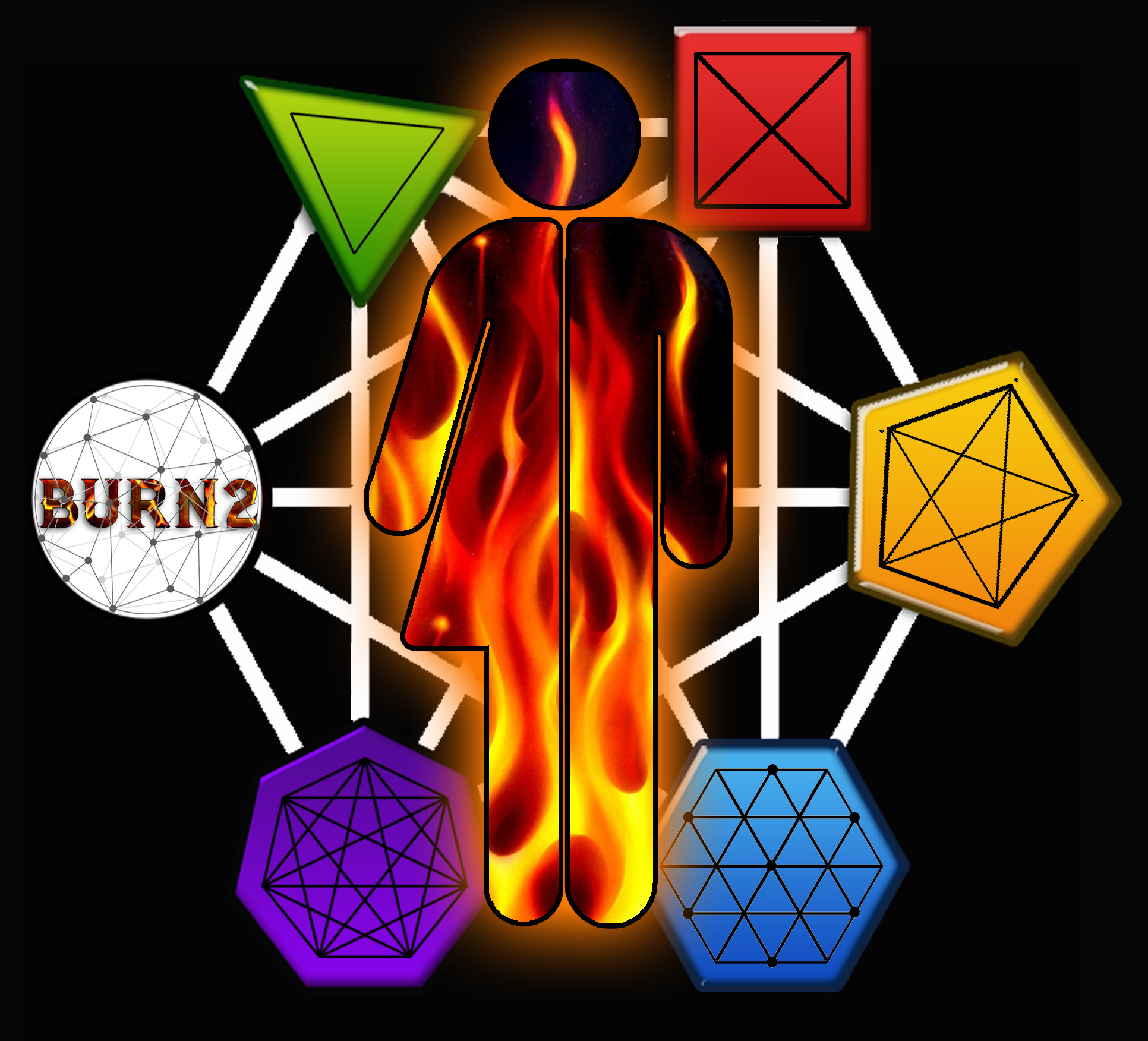
A dual silhouette of Male/Female. The background and the wiremesh frame can irrespectively be white/black or black/white. The silhouette can inside likewise be pure black with the fire aura or without and the silhoutte can be transparent , so the wiremesh frame can be seen within the fire aura. The surrounding 6 forms: Circle, triangel, square, pentagon,hexagon and the heptagon all connected and united with the wiremesh frame illustrate the basic elements of virtuality. Particle, prim and polygon I like to present a duality version of my concept of a new Burn2 logo: As people we need move forward and it is in this spirit of human unity, as brothers and sisters, as we all belong to the same family, i like you to address this issue / question of a unifying logo of the 2 original universal genders...Yes i do respect peoples personal associations to variation, but irrespectively of a large accepted physical, philosofical and personal preferences by many people, the roots of our creation as such is a dual concept. We are created with a large variations of sexual preference (even none), but for 2 personalities (irrespectively of their own personal preferences) to be creative, only male and female is the option as such if we want to recreate and multiply. The togetherness of the core genes from the 2 basic genders is essential for the fruits of love to be cosmic realized as a new born human child of unlimited potentiality. Racial intermixture increases the likelihood of a larger number of the desirable dominant genes being present in the outcome. So the concept of duality & unity, male and female in harmonious cooperation, is a little step toward good will and peace between all people on earth.
This one illustrates a duality version as a figure. .Left female/right male outline. The figure has a double inside fire texture and I have added semi long black hair with minor coloured pearls to humanize the logo. The background and the wiremesh frame can irrespectively be white/black or black/white. The silhouette can inside likewise be pure black with the fire aura or without and the silhoutte can be transparent , so the wiremesh frame can be seen within the fire aura. The hair can be removed. The surrounding 6 forms: Circle, triangel, square, pentagon,hexagon and the heptagon all connected and united with the wiremesh frame illustrate the basic elements of virtuality. Particle, prim and polygon. See personal message in logo 1. description.
This is a pure male logo . The background and the wiremesh frame can irrespectively be white/black or black/white. The silhouette can inside likewise be pure black with the fire aura or without and the silhoutte can be transparent , so the wiremesh frame can be seen within the fire aura. The figure can be designed with a different kind of texture instead of (my selection of) flames ex: Nightsky with stars, the Milky Way even with the dusty desert texture used on the playa. The surrounding 6 forms: Circle, triangel, square, pentagon,hexagon and the heptagon all connected and united with the wiremesh frame illustrate the basic elements of virtuality. Particle, prim and polygon. See personal message in logo 1. description.
18 Jul 2020 @ 22:00 PM
10
Logos are tricky but necessary things. They are used to present a brand or identity to the world. In order to do that effectively in a number of opinions they need to remain relatively simple. Also, it's important to maintain continuity amongst logos in my opinion. unless there is some sort of drastic change, keeping some consistent elements and making an evolution of them ties the new logo back to the old. So with those aims I proceed to make this logo concept. This logo is designed completely in 3D using fusion 360 the lines were created using measurements and mirrored across common points for symmetry. The circular head and )( shaped elements were kept to both call back to the old burn2 and Burnigman logos. Gone are the cluttered shapes from the background of the old logo. Replacing them is an elongated wooden cube used as a torso referring to at the core of all SL creations is the humble plywood cube. Added above the head are three gem shapes in red, green, and blue. These gems represent the primary colors of light used in all computer monitors and thus also what builds our SL world. The arrangement of the gems is also intended to be reminiscent of the outstretched fingers in the logo of Second life signifying our existence within it. Final note is that this is merely a quick render of the final concept for demonstration purposes. Colors and aspects can easily be changed and I also need to investigate rendering options further to make a crisper render. I think this works for demonstration though. Also being that this is a 3D object it can fairly easily be imported to Second life to allow a full 3D representation of the logo. Thank you for the consideration of this concept.
Same as prior with added optional text. Font used is Raleway Heavy in order to match font used on Burn2 website. Font can be changed depending on preference.
Same as prior two versions but with the red green and blue elements reassigned to different parts of the logo.
18 Jul 2020 @ 13:46 PM
11
Another version from option 3 last round.

N/A
N/A
16 Jul 2020 @ 07:39 AM
12
I like the process of creating throughout the dimensions...this is like a snapshot of an in progress perspective (idea coud be developed more)

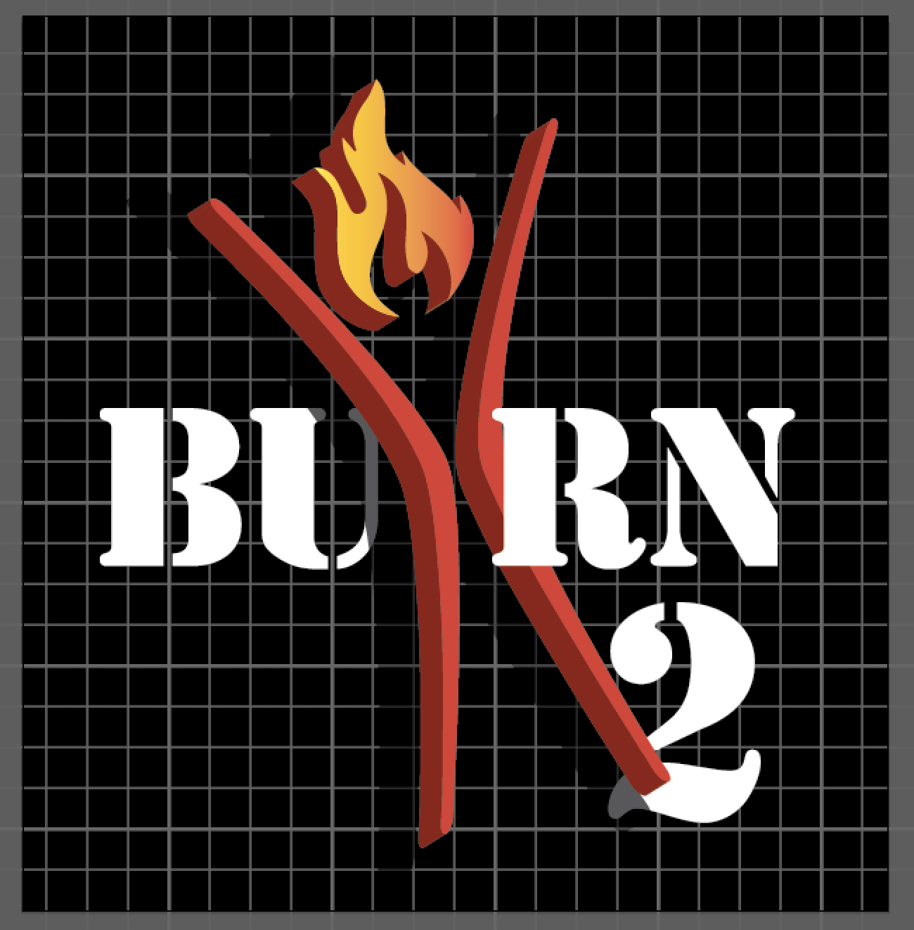
Similar idea as Design 1, different font & added a flame.

Similar idea as Design 1,2, stencil font & added a flame.
15 Jul 2020 @ 09:51 AM
13
Man head with man & fire inside, Includes our name.
Man head with man & fire inside, Includes our name.
Man head with man & fire inside, Includes our name.